HomeProjects
Slimvesteer
Apr '25

Slimvesteer

Slimvesteer is a personal finance platform I’m creating with a friend to help people understand money, without the jargon or overwhelm. After going through the process of buying my first home, I realized how scattered and hard-to-understand most financial info is, especially if you don’t have support from family, a notary, or a bank advisor.

I’m handling the research, design, and development of the platform. We’ve built it to be understandable, approachable, and ready to grow into something much bigger than a blog.
Slimvesteer mockup on Apple devices
Technologies/Frameworks used
Figma
KirbyCMS
Next.js
TailwindCSS
Google Forms
Behind the scenes

Creating a personal finance platform

We want to keep it simple

Slimvesteer is a platform I’m building with a friend to make personal finance less overwhelming. The idea came from my own experience: when I bought my first home, I realized how scattered and hard-to-understand financial information really is. Between advice from my notary, parents, the bank, and endless blogs, I had to piece everything together.

That made me wonder: what happens if you don’t have that support network? Especially if you’re in your 20s, have some savings, and no clear idea where to start.

The ultimate goal

It’s not about complex investing strategies or advanced finance. It’s about helping people take their first confident step—whether it's understanding how budgeting works, learning the basics of investing, or getting a sense of what buying a home really involves.

Our goal with Slimvesteer is not to replace financial advisors or offer advanced strategies. It’s about lowering the barrier to entry: giving people clarity, confidence, and a place to take their first steps with money.

The platform should reflect three values:
  • Accessibility: no jargon, no overwhelm
  • Clarity: structured content to take the first step
  • Scalability: room to grow into guides, tools, and interactive features

From research to product

I didn’t want Slimvesteer to be built on assumptions. That’s why I started with research and shaped the design and build around what people actually struggle with.

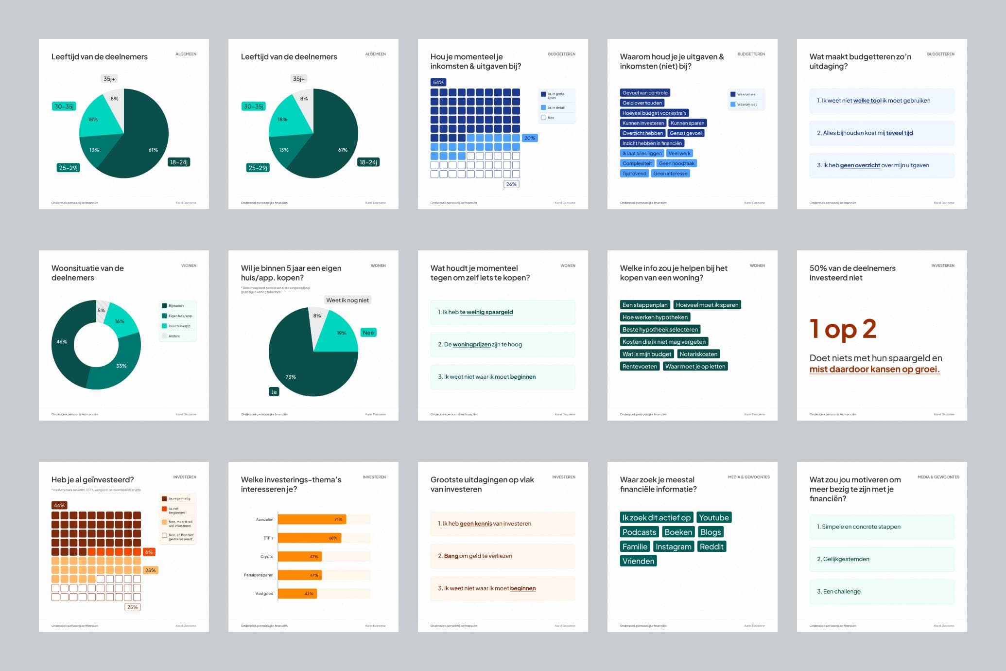
Research – understanding the problem

I ran a Google Forms survey mainly for people in their twenties and thirties, focusing on three areas: real estate, budgeting, and investing.

The results confirmed a big gap: most people feel lost, don’t know where to start, and are afraid of making mistakes. To make this more concrete, I turned the data into simple visuals that reflect the “average state” of personal finance. These insights helped define what the MVP should solve.

Find detailed results of the survey here
Slimvesteer desk research result visuals

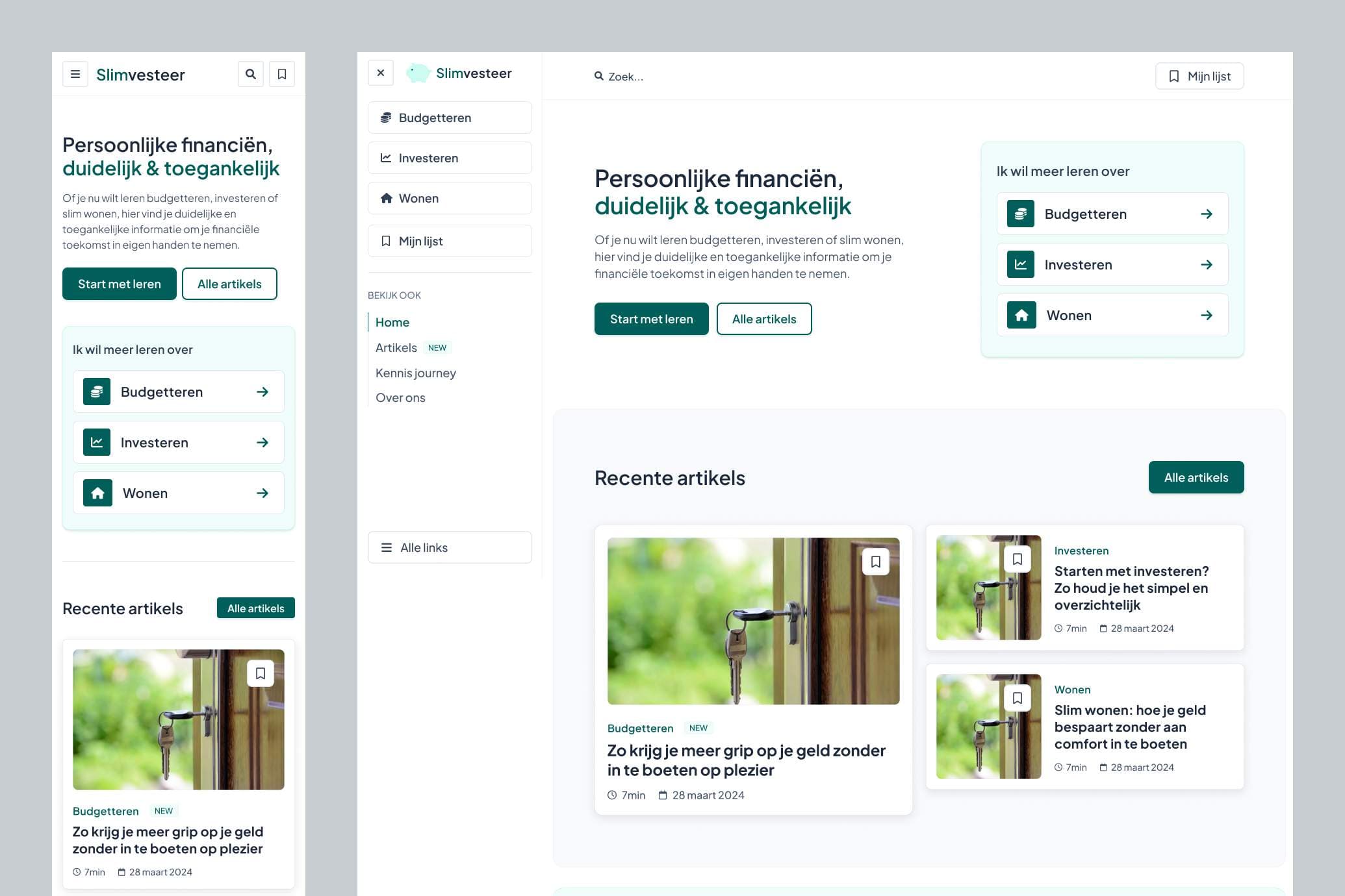
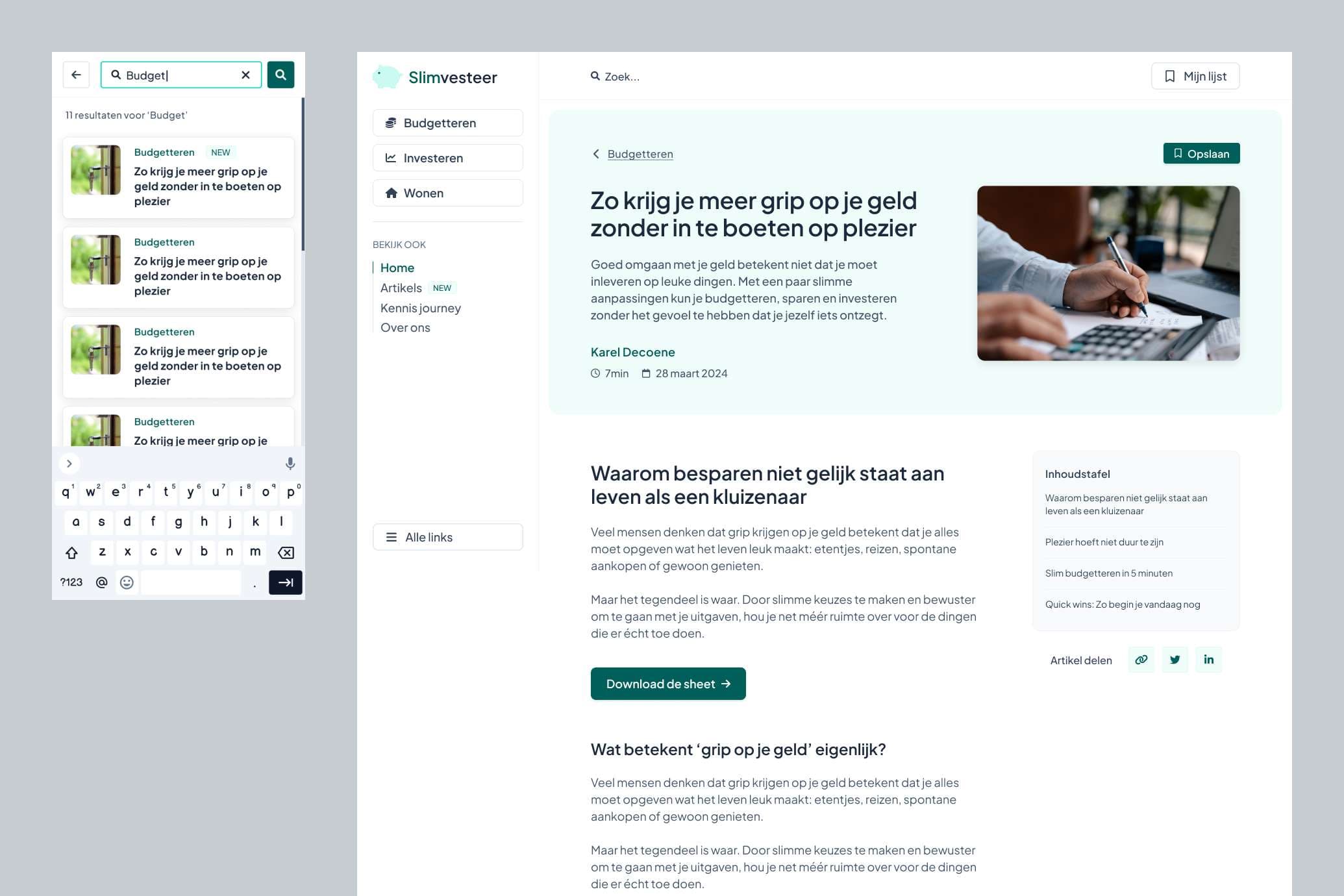
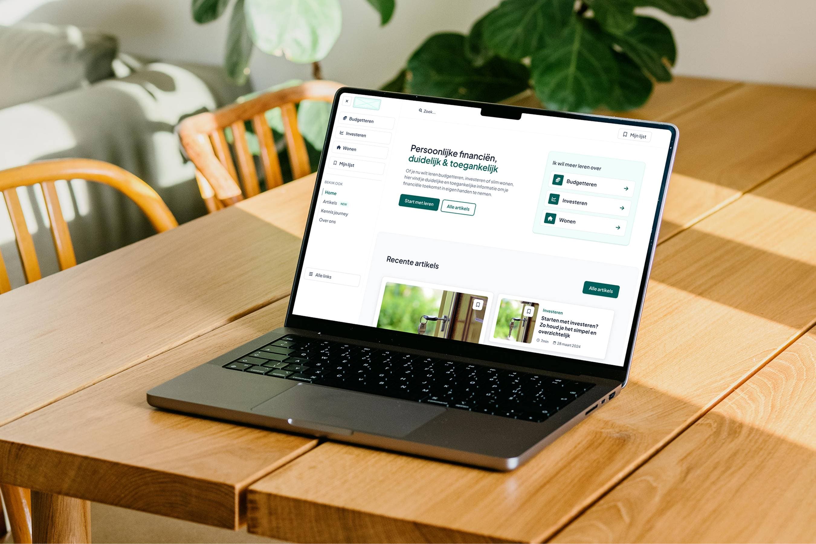
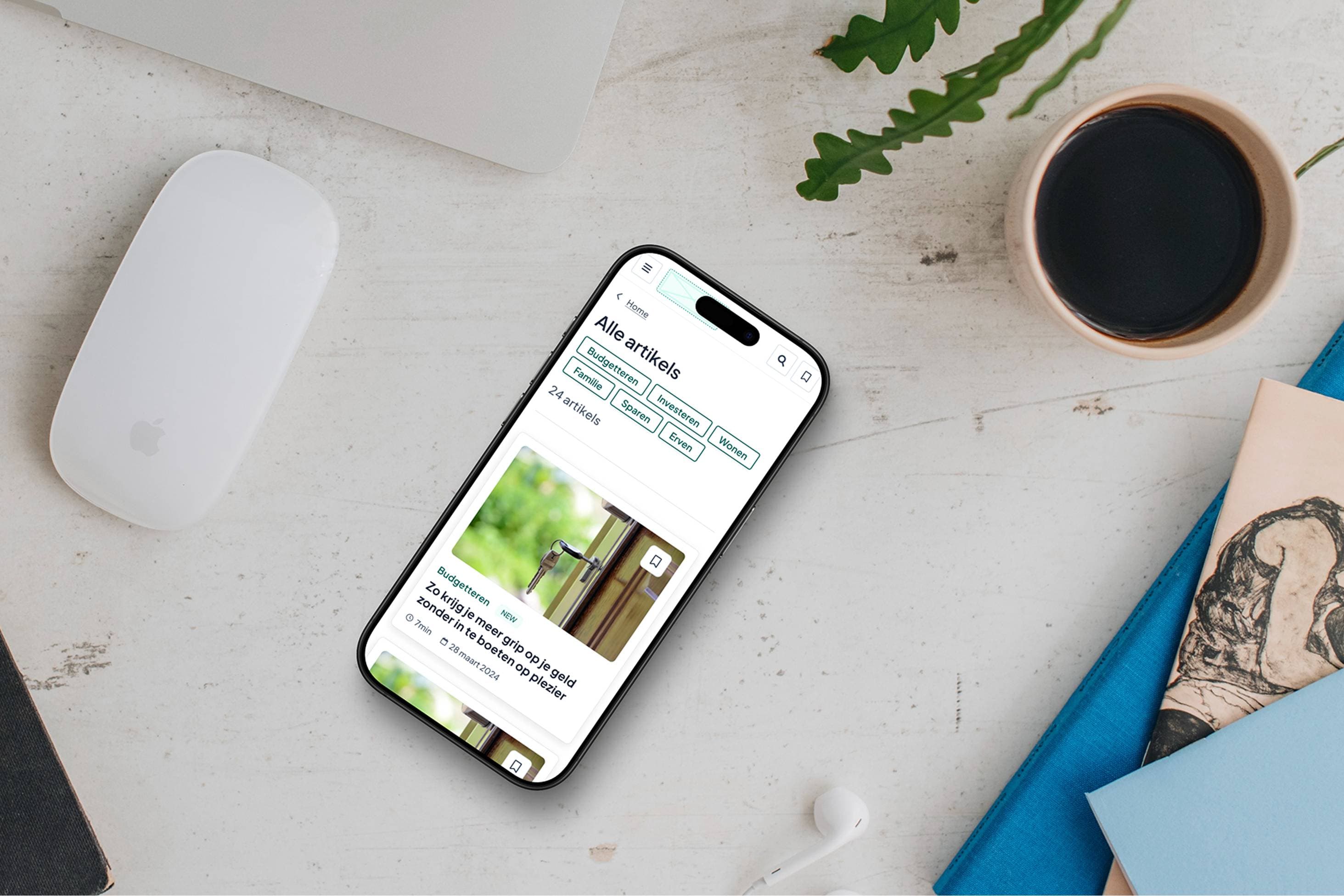
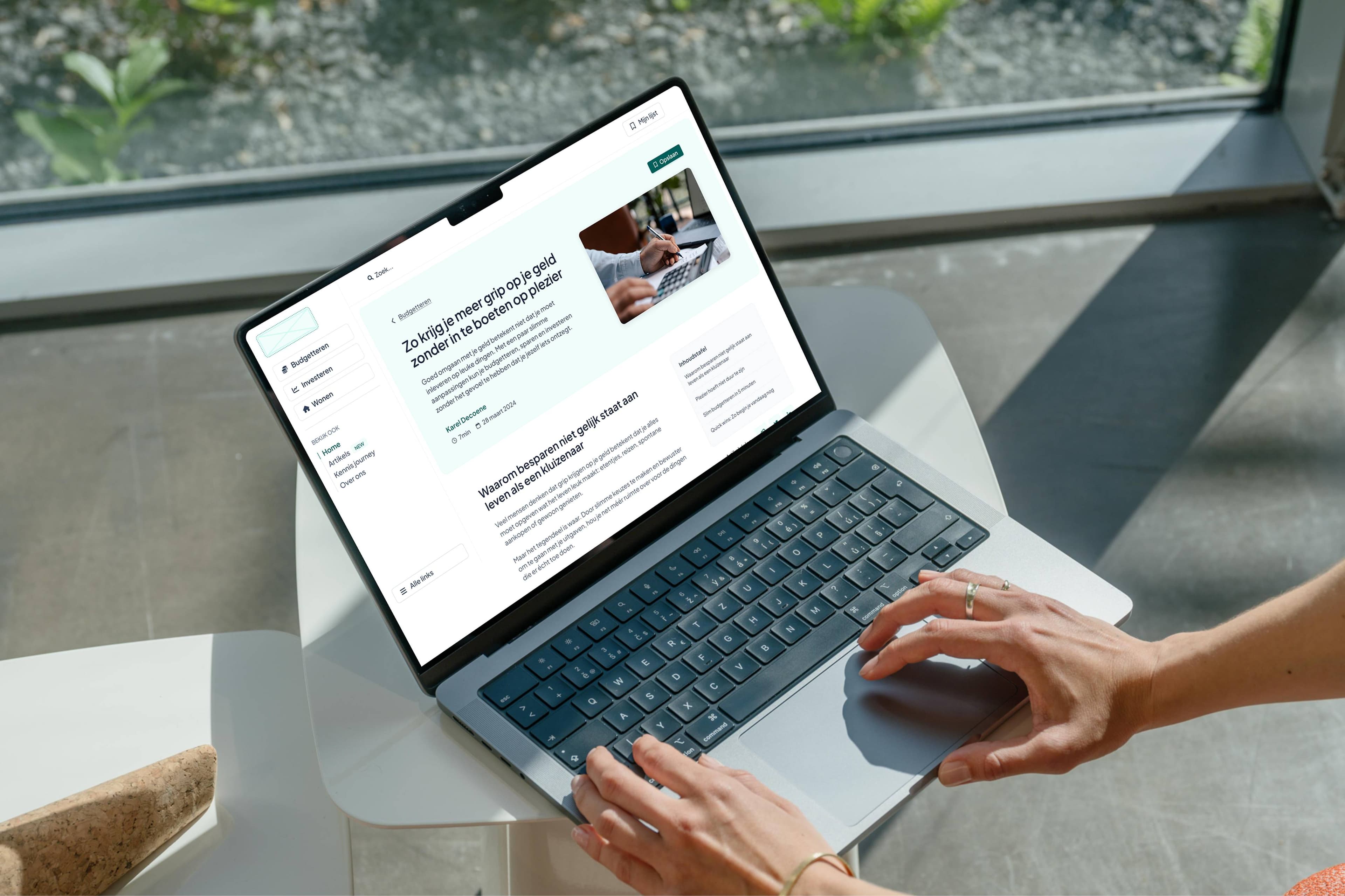
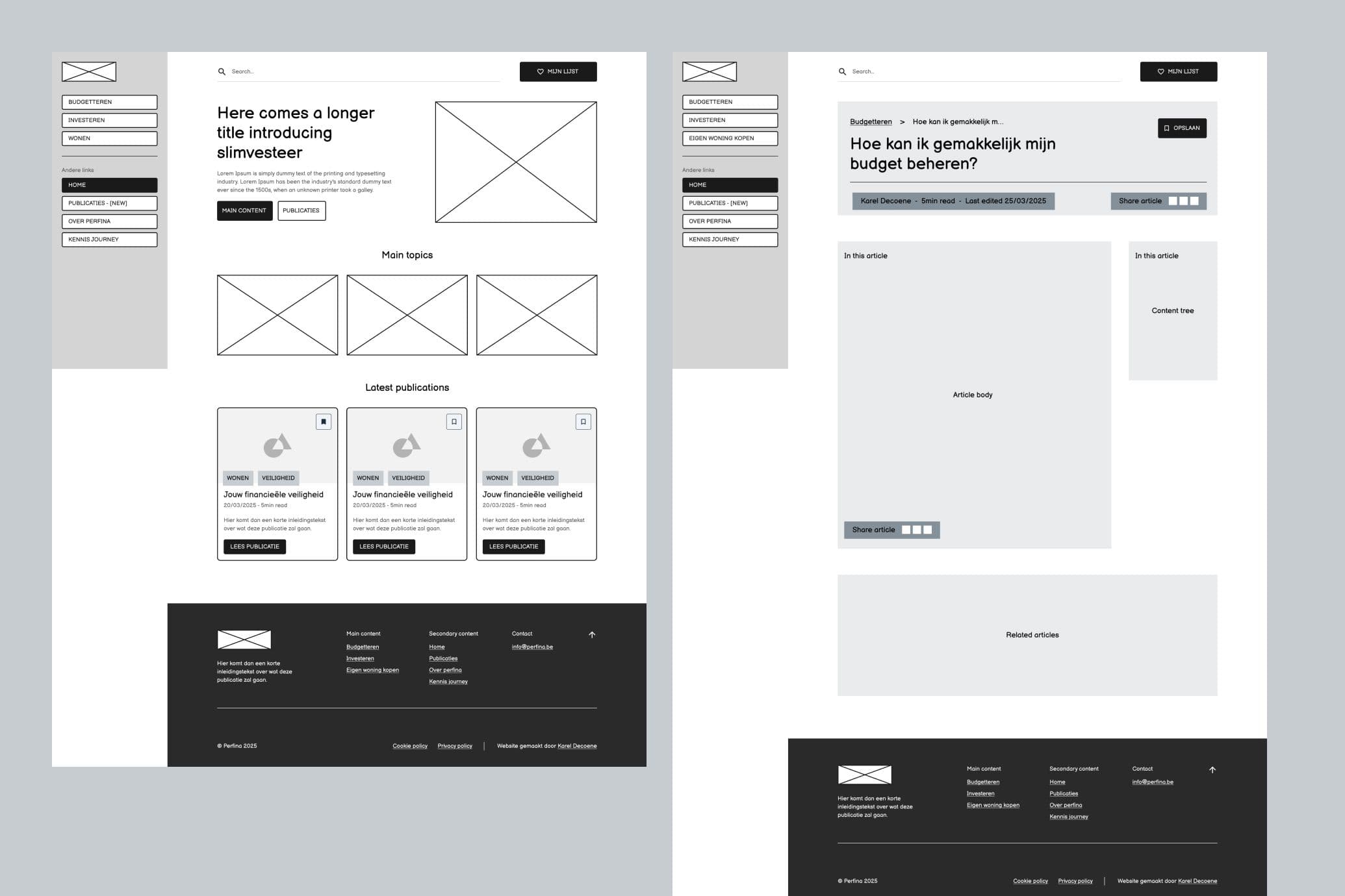
Wireframes – shaping the MVP

With the research in mind, I created wireframes to see how Slimvesteer could guide users step by step without overwhelming them. The goal was to keep things simple, clear, and focused on the most common beginner questions.

At first, Slimvesteer will start as a blog. Not “just another blog,” but one designed to feel more structured and accessible:
Snackable articles you can save for later
Simple visuals and graphs that explain finance at a glance
Clear navigation so readers don’t get lost
Wireframes of the Slimvesteer blog MVP
This blog setup works as our MVP: an easy entry point to test ideas and reach people quickly, while we prepare for the bigger features ahead.

Design – building consistency in Figma

After the wireframes, I moved on to turning the ideas into a clean and consistent interface. My focus was on three things:

Main focus

Responsive experience
I paid close attention to how the design works on both desktop and mobile. The goal was a recognizable experience across devices: simple, easy to find, and always clear.
Design system
I built a lightweight system with tokens for color, spacing, and typography. This kept everything consistent and scalable.
Design system & tokens Figma Slimvesteer
Reusable components
Cards, navigation, and content blocks were designed as components, making updates fast and future growth easier.
Components & blocks Slimvesteer

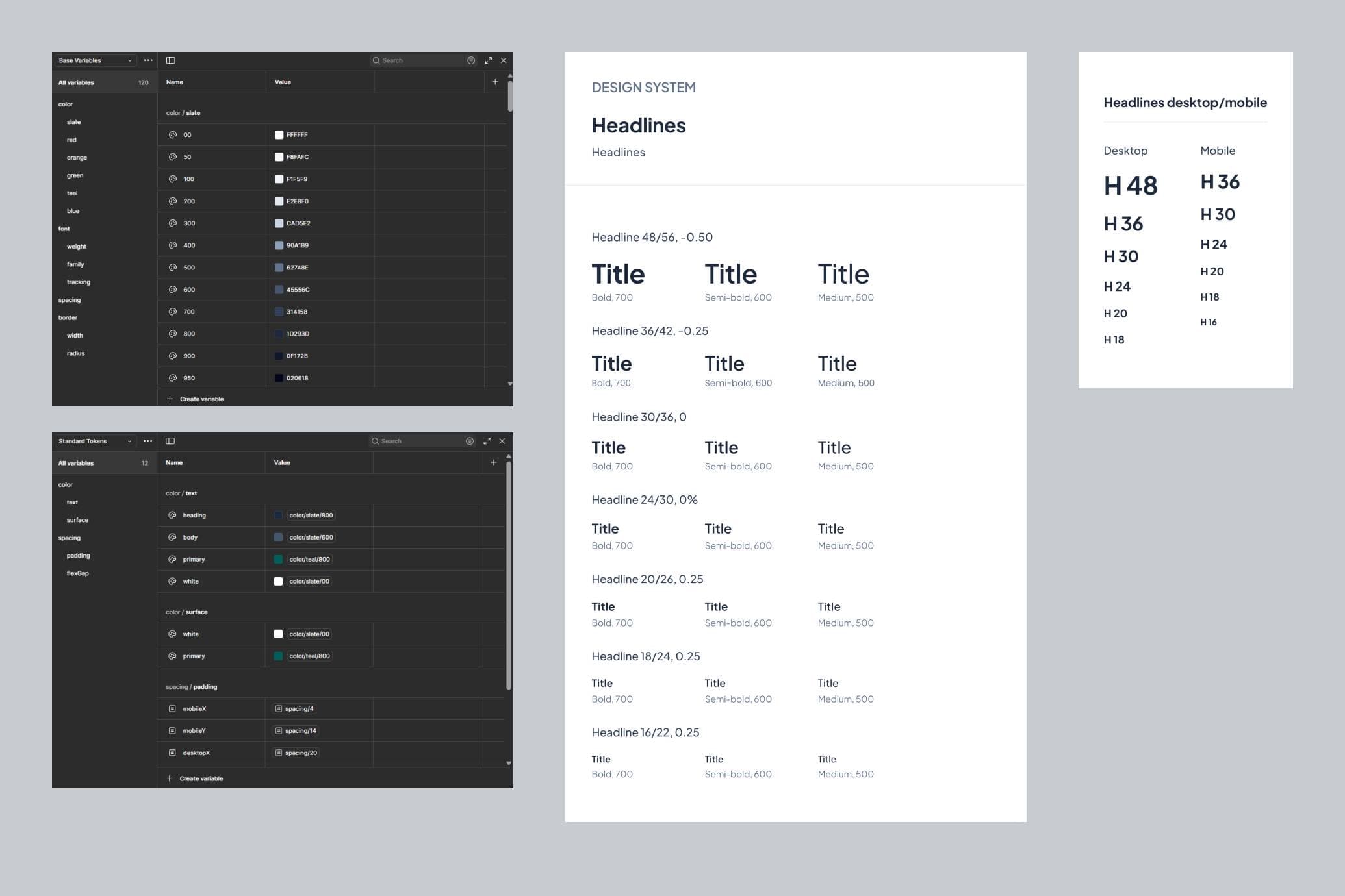
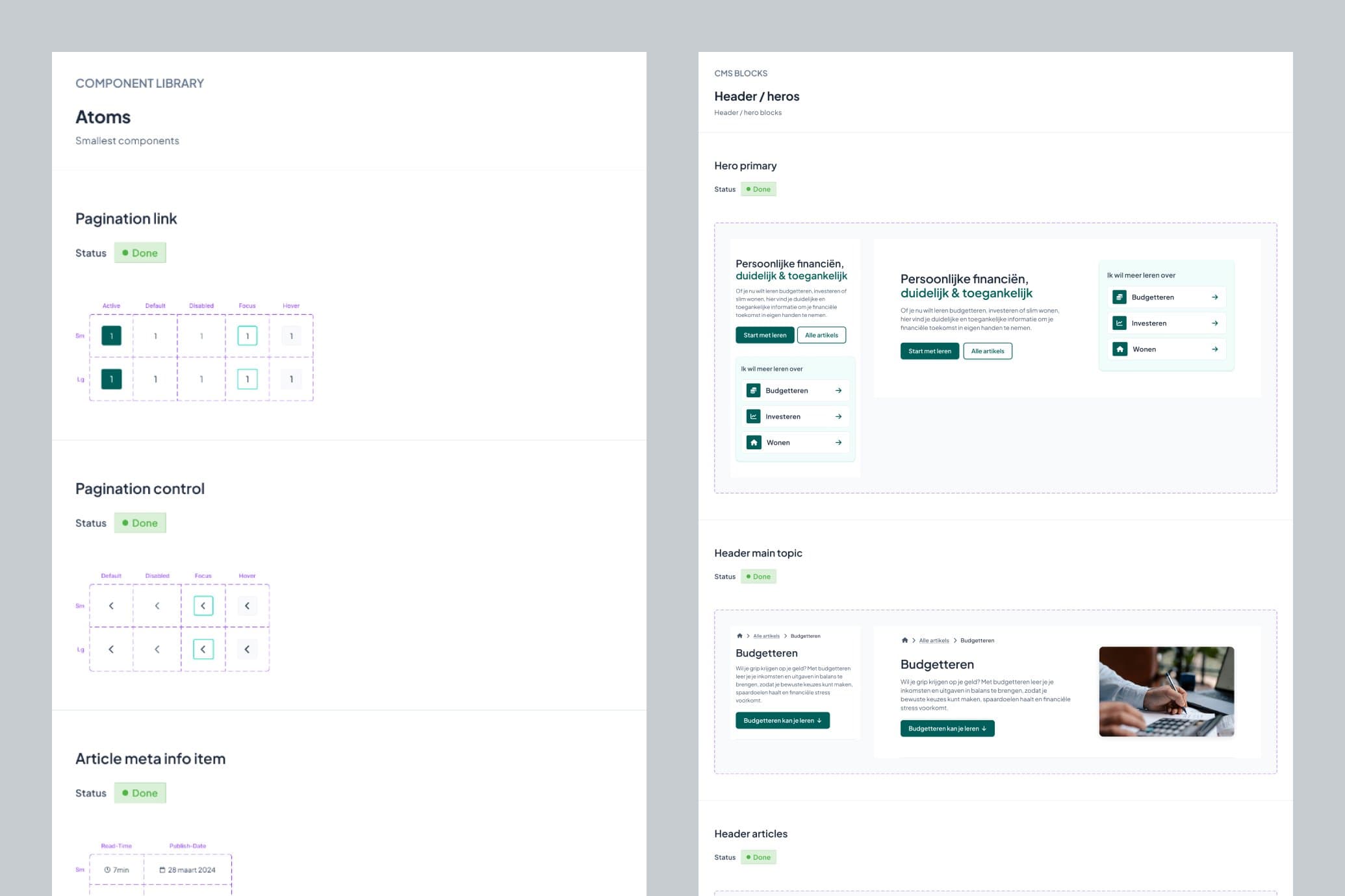
While not forgetting about UI details

Inputs defined as tokens
Auto layout wherever possible
Properly named layers for clarity
Layer order matching the visual order
Clear component structure with the Propstar plugin
All of this makes the design not just polished on the surface, but also well-structured under the hood.

I always use this Figma Design Checklist resource to make sure my Figma file matches certain standards in terms of consistency & structure.

The MVP final result

Slimvesteer MVP designs 1
Slimvesteer MVP designs 2

Next steps – where we’re heading

Slimvesteer is just starting. The next phase is to add interactive tools and guides that help people make smarter decisions step by step. The goal isn’t to replace experts but to lower the barrier and give people confidence in their financial journey.

Questions or just want to connect?

Don't hesitate to send me a message.